A Case Study in Fast-Paced Product Environments
The Challenge
In one of my previous projects, I worked with a fast-scaling product team that operated in a dynamic, consumer-facing industry. Part of my responsibility was maintaining and developing features within an internal admin panel used by customer support agents. Over time, the panel grew organically as new features were added on the go — and while that’s often necessary in high-velocity environments, it eventually led to friction in daily operations.
Some of the recurring issues included:
- Support staff constantly switching between multiple views, which increased the time needed to resolve cases.
- Inconsistent UI structure — elements related to the same workflow were sometimes far apart, or scattered across different pages.
- Each view had a slightly different layout or logic, making orientation harder.
- There was no logical, user-defined way to jump between related sections without retracing steps or scrolling.
The system wasn’t broken, but it had become inefficient — and it was clear something could be improved.
Realizing the Problem From Within
Interestingly, I didn’t discover the issue through user feedback or direct reporting. I didn’t work in customer service and had no regular contact with the team using the panel.
But because I was also responsible for testing the features I implemented, I found myself navigating the panel often. It was during these testing sessions that I noticed patterns: I was clicking more than I should, taking mental notes of “where things were,” and struggling to connect related elements.
That discomfort sparked an idea: what if I gave users the ability to build their own navigation on top of the existing UI?
The Solution – A Flexible, Context-Aware Navigator
Rebuilding the entire admin panel or unifying all views wasn’t an option — time and resources were limited. So instead of proposing a massive refactor, I created a lightweight tool that integrated seamlessly with the existing interface.
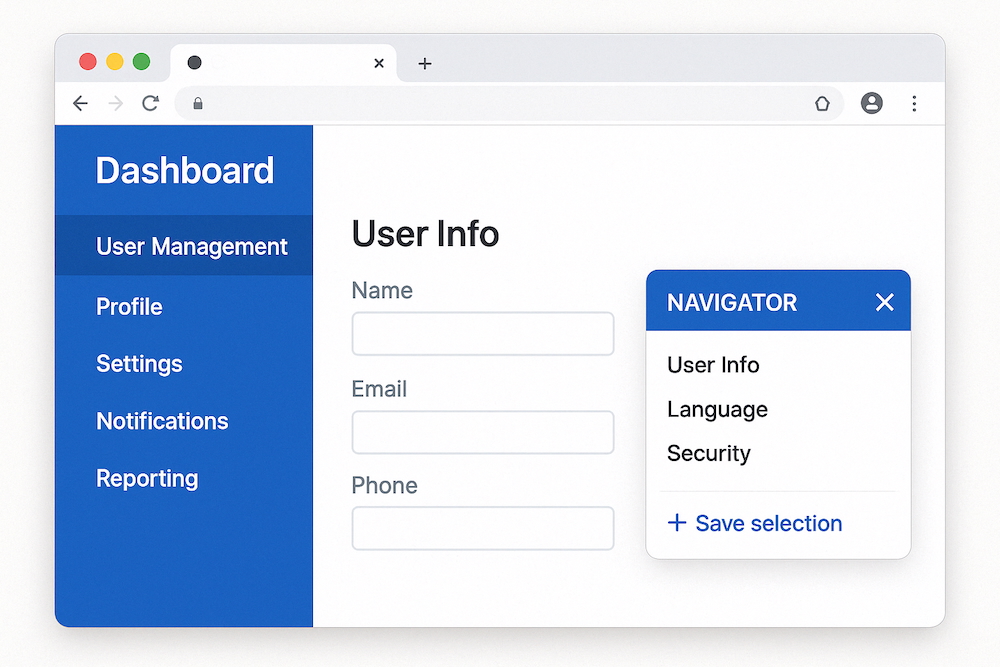
I developed a draggable, floating navigator, which worked like this:
- It could be moved anywhere on the screen and toggled via a discreet icon in the corner.
- Users could select any text on the screen — a section header, form label, field name — and save it.
- The tool would remember the URL and scroll position of the selected item.
- A list of saved entries allowed users to jump instantly to the relevant section, regardless of which screen it was on.
The result? Agents could build their own shortcuts. Instead of trying to redesign the entire interface for everyone, I gave each user the power to adapt the system to their workflow.
What Changed
Once deployed, the impact was immediate:
- Search time dropped significantly, since users didn’t have to reorient themselves on every view.
- No retraining was needed — users naturally started marking their own “anchors” and building quick-access lists.
- The navigator was used in ways I hadn’t predicted — some used it as a lightweight bookmark tool, others as a task queue.
The biggest success was that the tool didn’t enforce a specific behavior — it enabled users to work the way they wanted, without dictating structure or flow.
What I Learned
- As a developer, it’s okay — and necessary — to push back against velocity, but do it constructively. Raising concerns and proposing lightweight, focused solutions is more valuable than simply flagging inefficiencies. But it’s just as important to keep stakeholders informed and aligned.
- Not every fix needs to be structural. Sometimes the smartest move is to build something that works around complexity instead of removing it. In this case, adapting the workflow was more realistic than rewriting it.
- Avoid rigid mental models from previous jobs. Every product, team, and business context is different. Bring technical experience to the table, but design solutions that fit this environment, not the last one.
- If something feels frustrating during dev or QA, it’s probably worse for real users. Don’t ignore your own friction — it might be the earliest sign of a bigger UX problem.
- Give people adaptable tools. The best internal tools don’t dictate how people should work — they create space for individual patterns to emerge.
Final Thought
In high-growth environments, there’s rarely time to polish everything to perfection. But if you keep your eyes open — even during the most mundane test sessions — you might find low-lift ways to make someone’s job a whole lot easier.
Leave a Reply